Read below how my redesign generates $610k/ year in extra profit
CASE STUDY: SPIN REWRITER
Spin Rewriter is a SaaS tool for SEO specialists that need unique content to rank higher on Google, used by 181,000 customers.
My responsibilities:
Customer interviews, user testing, persona development, wireframing, UI design
Scope of work:
Landing page, long-form sales page, web application
See design detailsReached goal:
$610,000 in extra yearly profit
Live links:
www.spinrewriter.com www.spinrewriter.com/sales-pageBack story
I first met Aaron at a local marketing meetup lunch where he mentioned that he was the founder of Spin Rewriter, a SaaS tool used by SEO professionals who need to rewrite articles in bulk. Aaron mentioned that while his company was still making 7-figures in yearly profit, their revenue had been steadily decreasing by 10-15% per year since 2015. He assumed that the reason for this revenue decline was at least partly due to the SEO industry slowly moving away from the strategy of creating backlinks by using rewritten articles.
Then he showed me his website that hadn’t been changed since 2011:
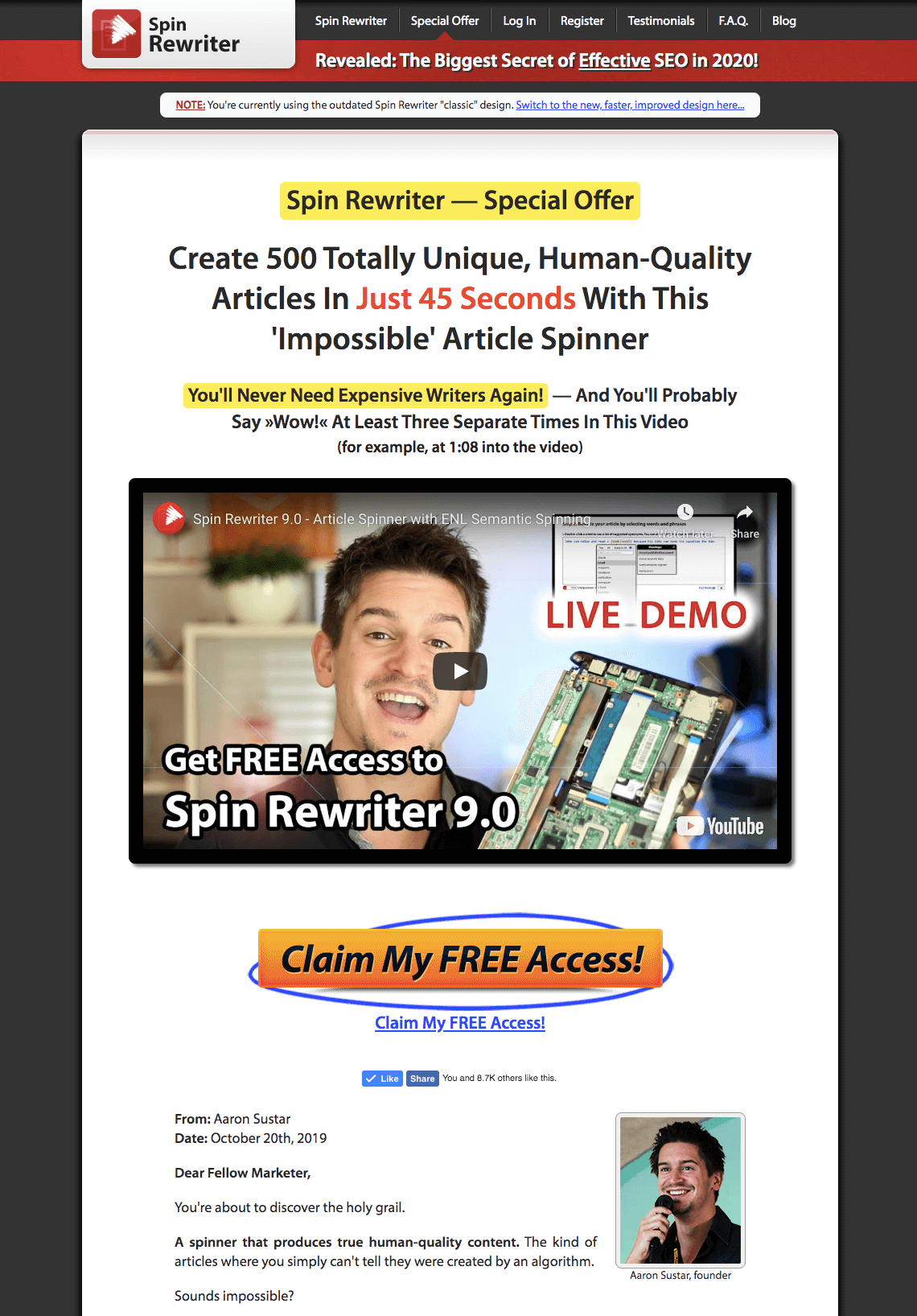
My first reaction was: “How the hell is your business so profitable when you have such a scammy looking website?!” ... but then I started to read the sales copy — which, I must say, was outstandingly written. As I kept reading further down the website, I realized more and more how Spin Rewriter can be really useful, and why it was so popular with Aaron’s customers.
I also immediately asked Aaron why he doesn’t do a design overhaul since the product itself was so popular and so profitable because a design overhaul would surely increase the trust of potential customers and hopefully increase his conversion rates in turn.
His answer was that he believes in the old marketing adage of “ugly sells”. In other words, ugly design sells, and if a potential customer actually has the intention to buy, they will buy the product no matter the design once they learn about the benefits. Also, he heard a couple of stories about how his marketing colleagues rolled out redesigns of their sales pages in the past and literally cut their conversion rates in half. Also, “don’t fix if it ain’t broken.”
At that point, I accepted his answer, and our conversation at lunch headed off in another direction. Probably something about girls that were walking by. Or cars. You know how it is.
But as I woke up the next day, Aaron’s answer that “ugly design sells” remained lodged in my head… and I found myself disagreeing with it more and more.
Also, Aaron and I really clicked as friends — so, naturally, I wanted to help him out by hopefully convincing him to reconsider redesigning his profitable website. It was that same day that I sent him an email with 17 bullet-points where I pointed out why he should reconsider redesigning his website and what he needed to take care of when hiring a designer.
Back then I was still occupied (more than) full-time by running ProteusThemes, my own design company that I founded years before and that I eventually ended up selling — so, at the time, I had absolutely no intention of working on the redesign with Aaron myself. I just wanted to help.
His answer was:

At that point, I was happy that I convinced him to redesign his website — plus my windsurfing trip to Egypt was coming up, so I politely declined his offer.
Three months later, I contacted him again to ask about the progress of his redesign… only to find out that he got in touch with 4 different designers, none of which convinced him enough to actually pull the trigger and start working on the redesign. I could still sense his fear of messing up his conversions and his (admittedly pretty great!) profits.
And so he asked begged me once again if I would pleeease do the redesign for him. Now, this time I took some time and put some more thought into it.
Aaron’s redesign project was interesting to me mainly for three reasons:
- I had never before been able to A/B test my designs at such a scale. The real-world difference in terms of conversions, revenue and profits that I could make as a designer was very tempting.
- Aaron is an interesting (and experienced) guy to hang out with, which means our communication would be smooth, fun, and educational.
- Doing custom design work would spice up my otherwise somewhat monotonous work of rolling out new WordPress templates at my own design company.
At that point, I honestly didn’t have a good enough reason to say no to him, so I decided to take a short break from running ProteusThemes and accepted the job.
Problems
- We didn’t know exactly who Spin Rewriter customers were, why specifically they were using the product, and in what areas of their online businesses they found it particularly useful.
- We didn’t want to lower any business metrics of an already very successful business.
- We didn’t want to ruin the overall brand look and feel. Approximately one-third of all traffic to the Spin Rewriter website was coming from existing blogs, review websites, forum conversations, and YouTube videos that were all showing the old design in various screenshots, so a dramatically different design language could have a negative impact on the website conversion rates due to a disconnect between all the positive (but suddenly outdated) marketing materials already spread across the internet, and the newly redesigned website.
- We didn’t want to annoy and potentially lose tens of thousands of existing users who were already using Spin Rewriter by rolling out an entirely different user experience inside the web application.
Goals
Our goal for the new long-form sales page and modern landing page was to increase the conversion rate from getting a website visitor to generating a free trial sign-up. We aimed to achieve this goal by using a design that stands out by looking trustworthy (this is especially important in the SEO niche because there’s a lot of genuinely scammy products available in that space), while not ruining the existing conversion rates and branding.
Our goal for the web application was to make it more intuitive for first-time users while not ruining the experience for those users who had been using Spin Rewriter for years. With this improved user experience, we wanted to increase the conversion rate from getting a free trial sign-up to having an actual paying customer after the free trial period. We also wanted to increase the time each user stayed with Spin Rewriter as a paying customer (retention).
Process
Initial Research
Preparation for interviewing Aaron
First of all, I needed a refresher course on what article spinners actually are, who is using them, and for what purposes. I started my research on Spin Rewriter’s existing pages. I analyzed their long-form sales page, their video sales letters, read all of the sales copy on their pages and promotional swipe emails read all of their 250+ testimonials from actual users and prepared my questions for Aaron about everything that I couldn’t find an answer for.
Then I decided to dig through all of the relevant forums, review websites, blog posts and YouTube videos to see what other people were saying about Spin Rewriter.
I also researched all of the competitors’ websites to see how they were selling their own article spinning tools and I took notes on what they were doing well — and what they weren’t.
Interviewing Aaron
Based on my research I came up with a list of around 20 questions about Spin Rewriter as the product, its customers, and the SEO industry in general that I wanted to ask Aaron.
In general, I wanted to know what he has to say about what his product does and who he thinks his customers are. More often than not it turns out that the founders of a particular business don’t actually fully understand which group of people they are serving, which specific problems they are solving, and what the “easy wins” in this regard are — and it turned out that in our case that was at least partially true as well.
Customer interviews
Then we picked 8 power-users out of Aaron’s list of customers and conducted 30-minute customer interviews with them. With these interviews, we wanted to understand who these people are, what they are doing for a living, why they are using Spin Rewriter, how important is this particular tool for their work, what are the things they like or dislike about it, why would they recommend Spin Rewriter to their friends, how much SEO knowledge they have, and so on.
These interviews gave us a good foundation to prepare the questions for our mass survey.
Mass survey of Aaron’s customers
Based on the insights we got from our 8 customer interviews, we decided it was the right time to do further research on a bigger scale, so we sent a survey to all of Aaron’s tens of thousands of users. In this survey we asked questions like, are people running their own online business or are they employed elsewhere, what’s the size of their company in terms of people working there, what’s the revenue of the company, what are their biggest challenges when it comes to SEO, what are their fears and frustrations about their online business, and so on.
Based on the interviews and further insights from our big survey, there were 3 typical “personas” that stood out. Now that we fully understood who Spin Rewriter was solving problems for, we could start focusing on the design.
Sales page (long-form!)
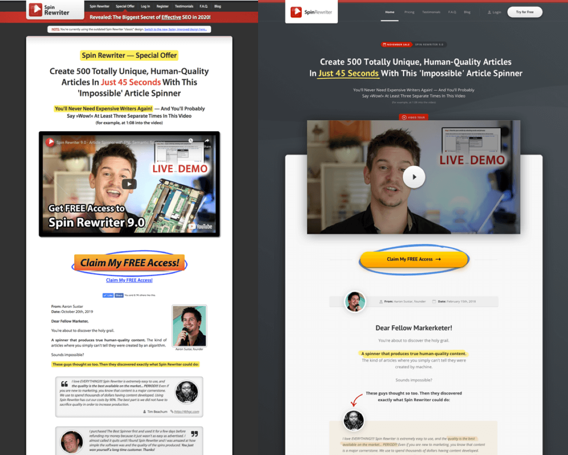
In this first phase of redesign, we took Aaron’s old long-form sales page and revamped it so it now looks much more modern and trustworthy. And yes, I know what you’re thinking: Long-form sales page?! Like the snail-mail letters I was getting in 1996? I hear you. But as it turns out: If your sales copy is good enough, long-form sales pages can be insanely effective — despite being 50,000px long!
Additional research
Live chat on the current (old) website
We added a live chat feature to the old long-form sales page to better understand in what phase of awareness the potential customers were coming to the website and which questions the current website wasn’t yet answering to a sufficient extent.
The questions we were getting through the live chat told us exactly how to further improve the sales copy and which website elements needed to be highlighted more in the new design.
Hotjar Heatmaps
We set up heatmaps on the current design, to see how deep on each page visitors were scrolling, what they were clicking, where they tended to stop and abandon the website, but we soon figured out that the current design didn’t really have many anomalies that heatmaps could help us spot, so admittedly this part wasn’t particularly useful.
Google Analytics
We went through the analytics to see if all the goals were properly set and if there were any conversion anomalies in the funnel that could be easily fixed, but everything was already perfectly set and prepared (Good job, Aaron!).
Sales page design
Low-fidelity wireframing
We didn’t want to waste too much time on wire-framing a 50,000px long sales page, so I decided to design the major unique elements and leave out the repeating ones.
Add my secret ingredient
Over all my years of building the ProteusThemes company and freelancing for clients, I ended up building dozens of sales pages and conducting many A/B tests. From all this experience I was able to create my own heuristic methodology with nearly 220 data-points that I know for a fact can have a positive impact on website conversion rates, in one way or the other.
Based on the 3 main personas we built and my personal experience I decided which ones to include in the project and which ones to omit.
Design language
The challenge here was to keep the same look and feel of the current design, and yet bring the design and the experience from 2011 to 2020 (and beyond).
The final design
We spent a lot of time in the research phase, and as a result, the process of actually designing the website went completely smoothly — from start to finish.
A/B testing
At this point, Aaron set up an A/A/B split test where he drove 20% of traffic to version A, 40% of traffic to another version A for (double) control, and 40% to version B, which was our new long-form sales page.
He also split-tested the traffic in 3 equal ways based on traffic source:
- affiliate traffic (from email campaigns of Aaron’s marketing colleagues);
- organic traffic (from search engines);
- direct traffic, referral traffic (from forums, blogs, and social networks), etc.
After our 5-week testing period, our final (statistically-significant!) results were in.
The new long-form sales page converted:
- 72% betteron affiliate traffic;
- 41% better on organic traffic;
- 39% better on direct, referral and other traffic.
These results were achieved with a 99% statistical significance. Also, the way we set up our split-tests as A/A/B tests allowed us to double-confirm that all of our testings had been done properly. In practice, once we’ve accumulated a large enough data set of visitors and conversions for a statistically significant outcome, both A variations were showing a virtually identical conversion rate while B variation was showing the conversion rate of our new long-form sales page.
Now, while the new long-form sales page was performing significantly better in terms of conversion rates, we noticed that organic, direct, and referral traffic wasn’t performing quite as well as affiliate traffic. Our hypothesis was that these potential customers are visiting our long-form sales page in an earlier stage of their customer journey — which means we should be showing these potential customers a different kind of a more modern landing page if we wanted to further maximize conversions.
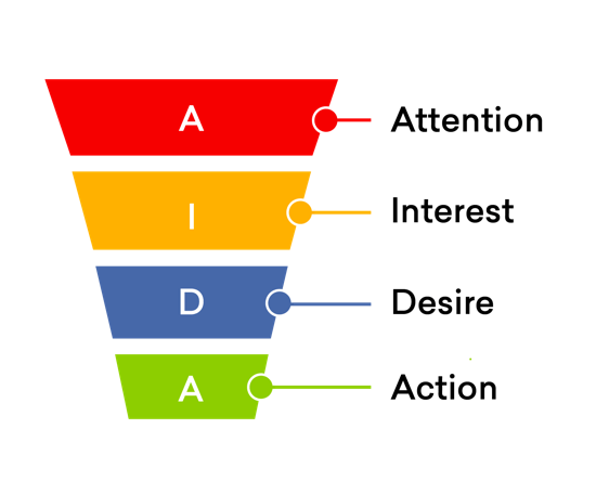
So, together with Aaron, we decided to create another landing page that was tailored just to potential customers that are coming into the funnel in the beginning phases of awareness.
Landing page
The classic long-form sales page wasn’t performing quite as well with traffic coming from search engines, referral traffic, and direct traffic, so we wanted to go with a completely different approach for these types of traffic.
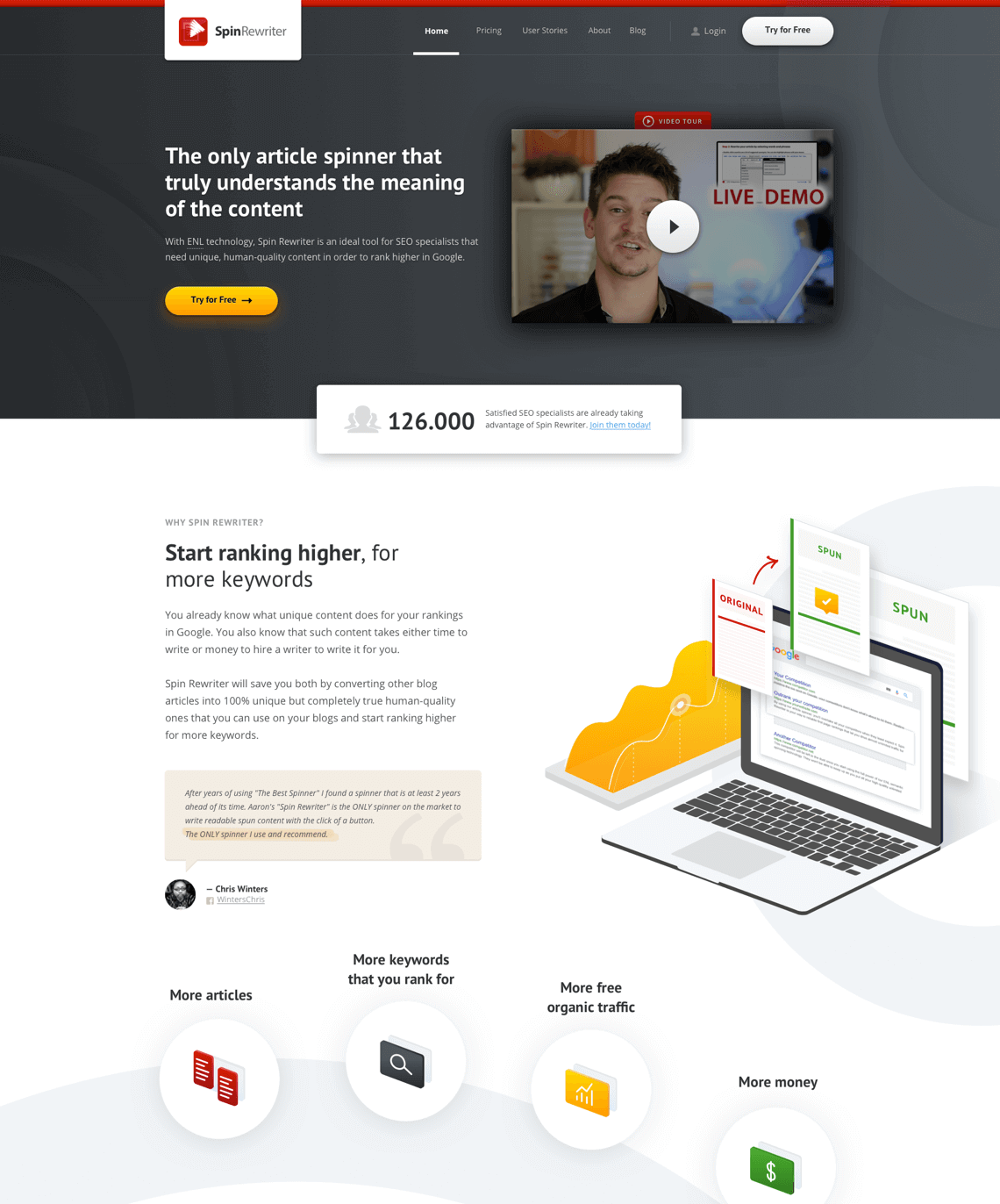
We decided to design another page that looked more like a modern SaaS landing page rather than a classic long-form sales letter. At this point, Aaron also mentioned that for once in his lifetime, he wanted to have a modern-looking website that he could shamelessly show to his colleagues without feeling like a sleazy marketer. So this was a win-win situation.
Customer interviews
We once again conducted 4 customer interviews, but this time with SEO marketers who had never used an article spinner before but said they might in the near future. We did this in order to better understand their point of view.
Wireframing & Copywriting
Based on the insights we got from these interviews, combined with the insights from our initial research, I prepared wireframes and sales copy that was tailored specifically to the customers that were coming to the website in the early phases of awareness.
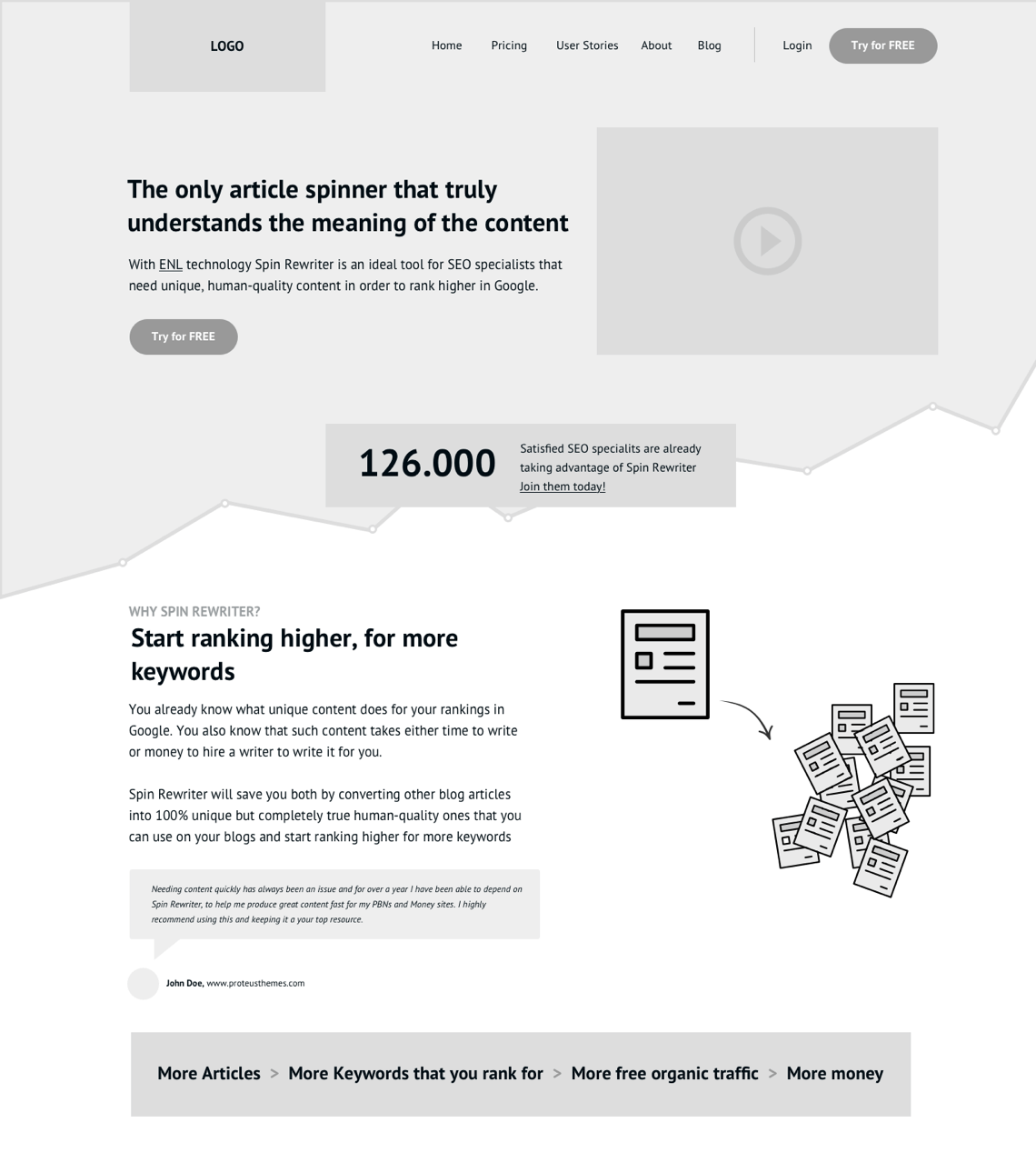
Design
Once we finished polishing the wireframes and sales copy, I created a modern-looking design of the landing page while still using the same design language as the long-form sales page.
A/B testing
Aaron once again did his magic with an A/A/B test where he tested different traffic sources (organic, affiliate, referral and other) across all the pages (old long-form sales page, new long-form sales page and a new modern landing page):
After another 5 weeks, we had our statistically significant results.
The new modern landing page converted:
- 66% better (on organic traffic) than the old long-form sales page;
- 54% better (on direct, referral, and other traffic) than the old long-form sales page;
- 29% better (on affiliate traffic) than the old long-form sales page;
- 8% better (on organic traffic) than the new long-form sales page;
- 7% better (on direct, referral, and other traffic) than the new long-form sales page;
- -14% worse (on affiliate traffic) than the new long-form sales page.
The results from the second round of split-tests were clear. Both the newly designed long-form sales page and the new modern landing page converted better than the old long-form sales page, which was expected.
At the same time, the hypothesis that we made after our first round of split-tests proved to be correct: The new long-form sales page converted better than the new modern landing page only on affiliate traffic while the new modern landing page converted better than the new long-form sales page on all other traffic sources (organic, direct, referral and other).
Web Application
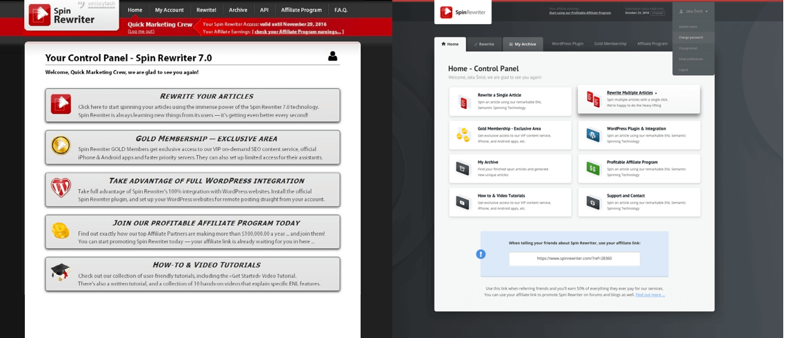
At this point, it was time to do the last part of my design job which was a redesign of the Spin Rewriter web application itself, i.e. of the interface customers are using to actually rewrite their articles.
The goal here was simple, but not easy to implement. We wanted to make the web application more intuitive for people who are using it for the very first time, while not ruining the experience for customers who had been using it for years.
User testing of an existing application
We tested the existing Spin Rewriter web application together with 8 potential Spin Rewriter customers who knew what article spinners were and what they are used for but have never used one until that point.
Together with Aaron, we set up 1 primary goal and 5 secondary goals.
The primary goal for each tester (each potential customer) was to rewrite an article in fully automated mode and then publish the rewritten article on their website.
Our secondary goals were as follows:
- Rewrite an article automatically, but make sure to use specific predefined settings.
- Rewrite an article manually, where the user needs to add 1 synonym to 5 different words and phrases.
- Rewrite multiple articles in automated mode.
- Rewrite an article, save it during the process, log out from the web application, and then access this article as a “draft” after logging in once again.
- Rewrite an article in automated mode and at the end, connect your WordPress website with Spin Rewriter and automatically publish the rewritten article to this website.
We wanted to understand the sources of potential friction inside the current user flow. This told us which elements we needed to rethink and redesign completely.
It was really interesting to see just how quickly these tests gave us valuable information on where we should be putting our focus. When we started working on the redesign, Spin Rewriter had been around for more than 8 years. During those years, a large number of new features had been added to the tool’s interface without anyone taking the time to step back and make some user tests to determine if the user experience was still good, especially for first-time users. Our tests clearly showed that the web application was getting hard to use, especially for brand new users.
Wireframing, prototyping & user testing (again)
User tests gave us an understanding of where the flaws and glitches were. Based on this information, I was able to prepare a new information structure where I grouped the features that I thought should go together and exposed/hid them based on how often they were being used by actual users of the product.
I also prepared a completely new visual hierarchy where I highlighted the important actions and gave users a better understanding of their current progress in the process of rewriting an article.
With the insights that we gained from our user tests plus my personal experience and heuristic methodology from dozens of projects from all of my years in the business, I was able to construct a redefined user flow. I connected wireframes to clickable prototypes so that I was able to do the user tests with the exact same goals once again (but with new participants).
These new tests immediately showed a major improvement with our set goals, both in the time needed to complete the goals and the clarity of user progression, as users asked approx. 75% fewer questions during this second round of testing.
After the second round of user testing, I needed to rewrite some microcopy and redo some of the changes with the updated visual hierarchy, but the flow was now completed.
All we needed to do at this point was to sit down with Aaron to determine if any of the new improvements would cost too much in terms of development time for too little improvement.
Design
Finally, I was able to take our polished prototype and put a beautiful design on it, using the exact same design language that we used for the new long-form sales page and the new modern landing page.
Results
I was 100% confident from the very beginning that I would be able to significantly increase Aaron’s conversion rates through a redesign of his website, but I honestly wasn’t expecting to see such a big improvement.
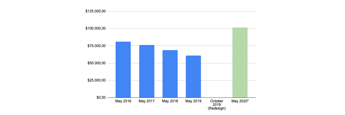
Here’s the bottom line: My redesign increased the revenue of Aaron’s business by 65% over the next 12 months (compared to the 12 months before the redesign) which resulted in an additional $610,000 profit in the first year.
To this day, every single time I meet Aaron for lunch, he keeps expressing his gratitude for the redesign and keeps telling me that I should have charged him much, much more for it.
Profit comparison for May for the past 5 years
The reasons behind such big improvement
First of all, we learned a lot of new things about who exactly Spin Rewriter customers are. Based on this information, we tailored the entire experience (sales copy, structure, design, user flow) specifically for these people.
The overall design of both the new long-form sales page and the new landing page looks much more modern and trustworthy which definitely has a positive influence on conversion rates.
The user experience of the entire Spin Rewriter web application is more streamlined, which means it’s more pleasant to use, which results in increased customer retention: users stay with Spin Rewriter longer in terms of being paying subscribers.
Lessons learned
Not all visitors are coming to the website in the same stage of product awareness. For this reason, it’s important to tailor the design of the long-form sales page, the design of the modern landing page and the message (sales copy) itself based on how much these visitors already know about SEO, article spinning, and Spin Rewriter.
Once again we learned that the more research you do at the beginning of the project, the easier it is to create an actual design that performs well in the end.
Even though user testing might seem like a waste of time at first glance, especially when talking about user interfaces that seem obvious and straightforward (at least to us), these types of tests are always extremely informative and are almost guaranteed to get you a number of “easy wins”.
Aaron's comment
Finally, here’s a couple of words from Aaron, a year after I completed his redesign project:
"...Our revenue shot up by 65% immediately."
I hounded Jaka Smid for 4 months before he agreed to take on our redesign. It turns out great designers are busy! But I didn't back down, because I KNEW Jaka was the right person for the job.
And once we got the ball rolling, every single one of his detailed updates and thoughtful emails blew me away. And here's the thing I loved the most: Jaka was always confident in all his decisions, taking a huge load off my shoulders, making sure everything ran smoothly, and delivering a truly incredible product in the end. Can you imagine asking your designer "what do you think, should we go with A or B?" and getting the answer "B, abso-fucking-lutely, 100 percent B, it's a no-brainer because of X, Y and Z" every single time?! That was such an unexpected revelation and an incredible load off my shoulders!
And finally, as a business owner, THIS is what you're probably interested in: It turns out Jaka was confident for a reason!
Jaka's redesign of our entire SaaS website was — by far! — the most important factor in our revenue growing 65% year-over-year
in the past 10 months since the redesign. Our business has been successful (by all means) but extremely steady from 2014 through 2019,
consistently bringing in about $1.5M per year. After Jaka's redesign in October 2019, our conversion rates / sales / revenue shot up
by 65% immediately, and 10 months later (August 2020 vs August 2019) we are still seeing the exact same 65% year-over-year growth.
This is truly INSANE — and if I could only ever recommend one person for any business-related thing in the world, it would be Jaka for delivering a redesign that looks great and CONVERTS. Which is all that matters!
 Aaron Sustar
Founder of Spin Rewriter, 8-figure company
